Thursday, 5 November 2015

Module 1, Chapter 11

This was my second chosen module and I really expected it to be my favourite. Initially, however, I was rather disappointed with my results and did not like any of the results from superimposing parts back in a different place. The 3 pieces I produced are shown below. I used Golden fluid acrylics on pastel paper in the case of papers 1 and 3, and ordinary cartridge paper for paper 2, the latter being subsequently overpainted with Neocolor II crayons in order to soften the white. In paper 3 I made my first 'brushstroke' with an oil pastel but it made a disappointingly weak mark.


Then, however, I started to isolate some sections and copy them into a Word document to play with them further. Wow! I could have gone on for ever, but the following are some of my most promising results.

The first two are just different arrangements of the same selection but in the second, the eye is very much drawn to the lighter area in the centre with the dark, bow-tie shapes.


In the next one the dark lines almost join to make a a continuous wavy line. I also like the suggestion of propeller blades formed by the yellow parts.


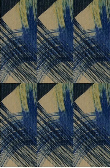
Then things started to get really interesting! Although the original paintings were somewhat dull because of the large areas of neutral background, I was able to make exciting selections by isolating a selection with more colour on it. By coincidence, it also contains one half-square and two quarter-square triangles and therefore lends itself to various patchwork patterns. The same 8 squares are used in each of the next 3 designs but with very different results. I think these are particularly successful because of the contrast between the bright yellow, the dark blue and the light blue.


In the last two variations I wanted to take a rectangle and play with offsetting it. Working in Word, this involved adding a square either before or after the rectangle. As it turns out, I like the effect this produces. I also like the way in which your eye sometimes zigzags down the central yellow brushstrokes and sometimes down the darker blue bits.


To sum up, this has been a really good chapter with endless possibilities. It has also taught me that Word is not a good programme for manipulating images, at least not if you want to save them as a jpeg image! However, in overcoming the problems I have also learned a lot more about using my computer for this type of work. In the end, in spite of kind suggestions from my techie husband and from Siân, I found the answer all by myself and that is most gratifying. For future reference for myself as much as anything, I used Preview to take a selective screenshot of the page in the Word document, then exported it as a jpeg. Simples!

Wednesday, 4 November 2015

Module 1, Chapter 8

I chose Chapter 8 as the first of my options and spent many happy hours abstracting and developing designs. The exciting thing about these exercises was that I did not feel in control and shapes seemed to develop themselves - for better or worse. Some of my initial attempts are shown below, together with a reminder of where the tracings were taken from.


These particular ones are interesting but are not really to my liking.

The next one, developed from a stylised version of one of the engravings on a gravestone in Holland produced a wonderfully dynamic shape which I can definitely imagine using at a later date.


The next ones were developed from the earlier shape exercises in Chapter 4. The solid simplicity of the first shape instantly appealed to me, perhaps because of the gorgeous background colour, but I could not immediately see a way of developing it.


By now I was in my stride and had great fun with the designs I developed from the brass screen on page 35, which has always reminded me of a peacock feather. I think the designs have an "Art Nouveau" feel to them and I especially like the contrast between the straight, regular lines and the eliptical shapes in between.


Annoyingly, I can no longer remember where I took the tracing on page 95 from. To me this is definitely a prehistoric cave painting of a dog and I just love the simple lines.


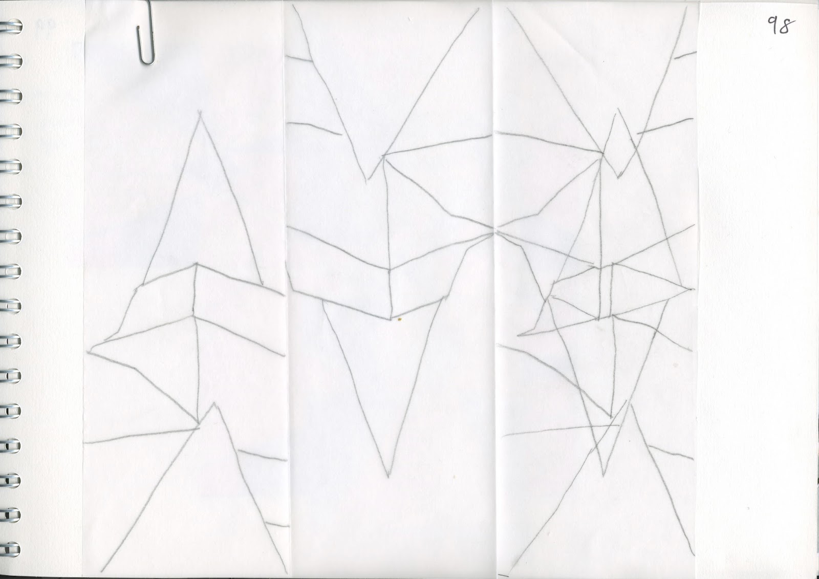
 I then went back to my church tower drawing with its strong, geometric shapes and selected an area to trace. I then traced the same section again the other way up and combined the tracings into one.


I reproduced this combined tracing onto cartridge paper 3 times and coloured each version differently. I then made a copy of the coloured version and manipulated it. In the case of the first, I cut the piece into 6 horizontal strips and reassembled them.


I cut the next one into 4 vertical strips (although shown here horizontally for space reasons).


In the final version I used a round paper cutter to remove circles which were then repositioned elsewhere in the design. Unfortunately my large paper cutter must be a bit blunt as it mangled some of the shapes, but the overall effect is still visible.


I then returned to following the chapter more closely and decided on my "recipe words": arch, point, diverging/converging lines, teardrop, square grid. I was unsure how to use them but decided to take one of my earlier designs and amend it in line with the design criteria. I took the shape on page 92 and enlarged it before making the changes. The resultant shapes were then used as templates for the  version shown, which meets the criterion of being made of light values with one dark area.


For the examples for the next exercises, I used a printed version of the same design and gouache. Top left shows the use of analogous colours with one area in the complementary colour. Unfortunately the blue-greens are so analogous that they do not show up very distinctly in the scanned copy!
For the other 3 examples, I decided to work with a different pair of complementary colours for a change. The colours definitely "pop" more when there are unequal proportions of the colours.


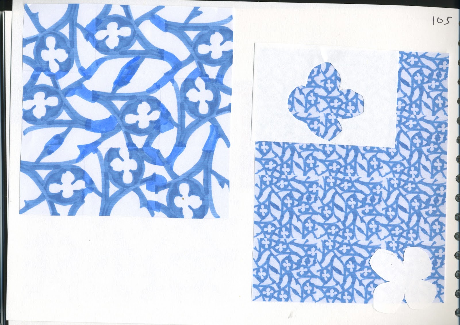
The next designs are an illustration that your mind is always working, even when you think you are doing something else! I was in the middle of translating something for the EU when I suddenly had an idea about a section of a photo which would make an interesting design. I drew it out there and then with what I had to hand - initially pencil, then highlighter pen. I scanned in the image and arranged multiple images at random in a Word document to form a series of tiles. I then joined these together to make a single, more coherent tile and again arranged the images as tiles in a Word document. The end result reminded me of the sort of beautiful tiles you see in North Africa.



I then went off on another tangent to revisit the idea of grids. I did quite a lot of work on this during my Certificate course and love the idea of distorting a given shape in order to make it fit into a grid. This seems to work best with simpler shapes, such as the gravestone/person. Square grids can also be applied to circular shapes. The additional traced circles are from tracings of interesting pieces of the original drawn grid.


I was initially unsure how to approach the texture part of this chapter but ideas usually come once I start and so it was again in this case. In the first sample, I cut teardrop shapes from craft foam and stuck them to stiff paper. I then covered the whole thing with PVA glue and pressed fine tissue paper over the top, taking particular care to ensure that the shapes did not lose their definition. A smear of treasure gold applied from just one direction (not so obvious on the photo) highlighted that side of the relief and also highlighted the wrinkles in the tissue paper. I love treasure gold but this was also a good reminder not to be too heavy fingered as a little goes a long way! Fortunately this has been hidden on the sketchbook page.


In the next sample I first made a grid with appliglue and then sprayed it with Brusho shimmer spray. The superimposed window arch is also made from craft foam coated with treasure gold.


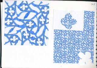
For the final sample I cut an on-point grid from paper and sprayed it with Brusho. I then found that I also liked the background paper on which the grid had acted as a template so I decided to use that as well. The blue is a nappy liner sprayed with Brusho and manipulated to form a rough grid.


The three together form a pleasing arrangement in my sketchbook.


I also made a similar grid using modelling paste but I suspect that it will be some time before it is sufficiently dry to do anything with!

Tuesday, 3 November 2015

Module 1 Chapter 7 additions

Following Siân's comments and as I was not at all satisfied with the rather bland samples I had produced previously, I decided to do a couple more which would hopefully be a bit more exciting. In sample 6, I again used automatic stitches on the machine as the background in various shades of blue and grey. I superimposed onto this an arched window made by machine stitching the shape onto Thermogaze, a stabiliser which is removed by the application of heat. As the gauze was disintegrating, I realised that I actually liked the ragged, distressed look around the stitching so did what I could to preserve some of this.


However, when it was applied to the background and further stitched, I still found the piece very bland.


As is frequently the way, I put it aside for a few days and inspiration came to me - in the form of John Piper no less! I recently rediscovered his work and it was then obvious that my piece lacked drama. What it needed was contrast, so I carefully painted the now rather fragile Thermogaze with black ink. It is still by no means a masterpiece but I do think that even a little black has improved it considerably and given it something of a Piper-esque quality.


This whole exercise made me realise, however, that I simply am not inspired by the grey, wishy-washy side of my colour palette so I got back to some more dyeing, especially in the indigo/dark navy range of colours. I find these strong colours so much more exciting.


I then made another sample using some of my newly dyed fabric and threads. The design is based on the frieze around the carving shown on page 15. The stitching is simple, just layers of chain band and French knots, overlaid in various colours, but I find the stronger colour palette and greater contrast much more exciting and inspiring.


I have also been experimenting with discharging, one of my favourite methods for decorating fabric. Initially I experimented with using thickened household bleach on paper covered with varying shades of Quink ink. The diamond shaped stamp is made from foam stuck onto foam board. The window stamp is in fact an impression of my long-serving lino plate, made using the foam which is heated and them pressed into the item. I was especially pleased at the quality of the print given that it was "second hand". Also, using this method enabled me to keep my precious lino stamp away from bleach.


I then used the same method on pieces of fabric dyed with Procion MX dyes:


The result on the dark blue Procion dyed fabric was disappointing, however, as the colour bleached to a pink, which is not at all what I was hoping for.

I then tried the same process on some black discharge cotton, firstly using the thickened household bleach and subsequently using Jacquard discharge paste.  


This picture shows the result of using the household bleach, whereas the picture below shows the result of using the discharge paste.


I love the slightly eerie quality of these prints and am sure that I will find a use for this effect in a future piece of work.

Thursday, 17 September 2015

Module 1, Chapter 6

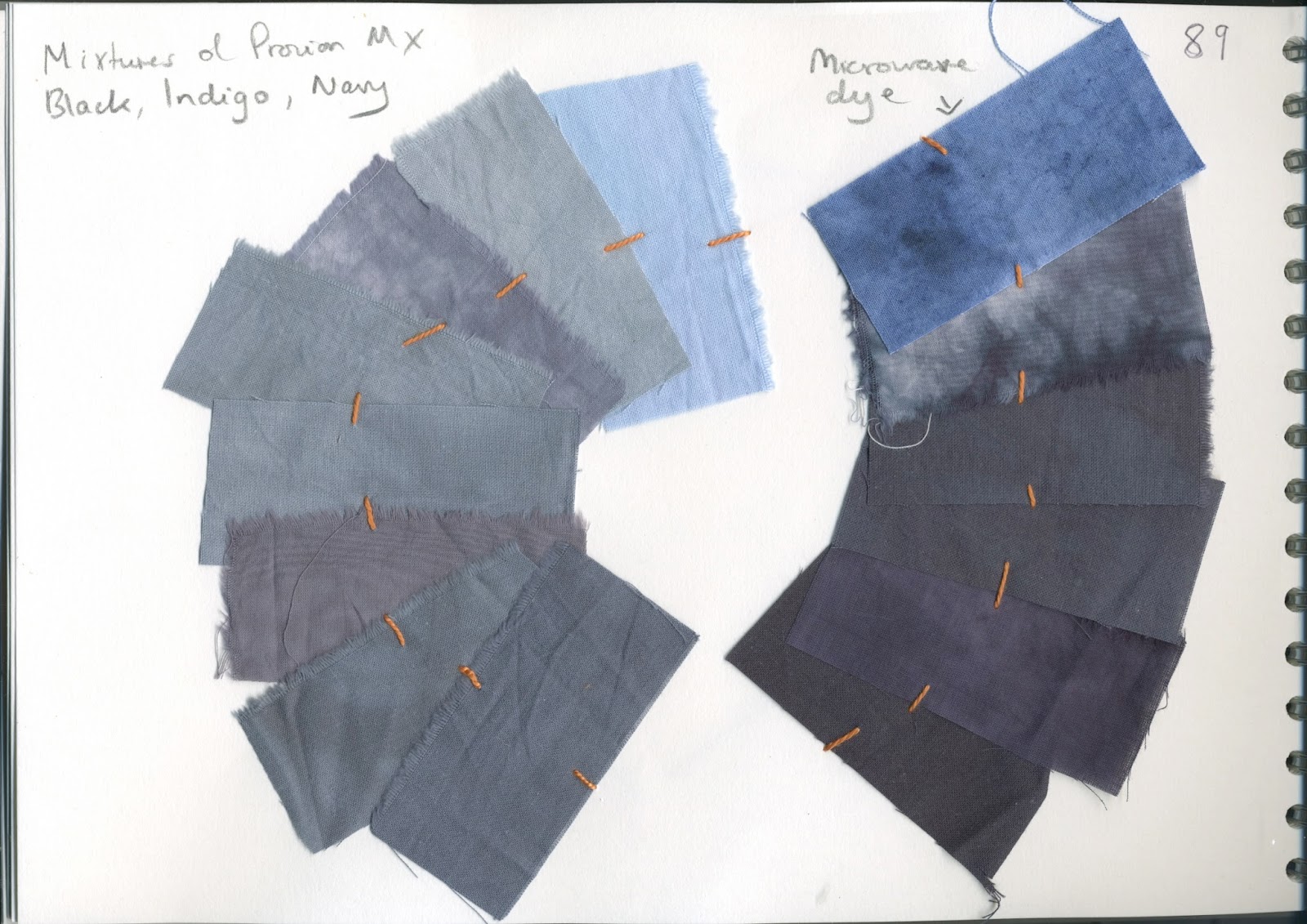
Since doing a number of courses over the years, I have developed quite an interest in fabric dyeing and have a large stock of fabrics which I have hand-dyed. I therefore decided to look through my stash and identify a selection of fabrics which are approximately in line with the colour scheme developed in previous chapters.

Looking initially at the ochre/gold range of colours, I chose the following:


On the blue grey side, I chose the following:


I am not naturally a methodical person and have not recorded precise dye recipes, although I do keep a book with painted colour swatches of some of the Procion MX dyes I use, together with a similar record for many of the other art materials in my collection, such as Brusho, Inktense, Kohinoor, acrylic paints etc.


I realise that this is probably not best practice for a prescribed course, but for my own purposes of creativity for enjoyment and pleasure it works fine. I especially enjoy the serendipity of experimenting with adding random dyes, albeit chosen with regard to the colour wheel so as not to produce too much "mud" - although even mud can be beautiful!

Most of the fabrics shown above were made using Procion MX dyes. I usually soak the fabric first in soda ash solution, then place it loosely scrunched up in a resealable plastic bag and add my chosen dye solution(s). After squeezing the bag gently a few times, I often add another piece of fabric on top and squeeze gently again. Sometimes I use a pipette to apply colour to a specific area. I prefer not to use too much liquid as I find the colours can then become too uniform.

A few of the fabrics chosen from my stash were coloured using Omega Dyrect microwave dyes. I have had great success with these, especially when combining colours. Indeed the Level 3 Certificate piece used as the background for this blog was made entirely with fabrics dyed in this way. I have heard some people suggest that they are not as light fast as Procion-dyed fabrics but the cushion in the picture has been kept in a sunny room for several years now and is still as bright and vibrant.

Tuesday, 9 June 2015

Module 1, Chapter 7

All samples are approximately 15 cm maximum.

Sample 1 is made using one of the pre-set embroidery stitches on my Bernina. Although I was unfortunately not able to make it any larger, it does mimic beautifully the pattern on the little fishermen's chapel on page 34. The small hand-stitched areas are based on the pattern on the stone doorway at Ely (page 29). I particularly like the way that the two areas in variegated thread (bluey-purple and slivery grey) seem to float above the flatter areas of colour.


In sample 2, I started by using another of the Bernina pre-set stitches which reminded me of the pattern on the doorway referred to above. However, when stitched onto a grey felted background, made using wool tops and the embellisher, all the definition was lost so I stitched the grid and flower pattern over the top using free motion. This sample reminded me how satisfying it is to stitch onto felt, whether by hand or machine, as the stitching blends in and a pleasing texture is created.


Sample 4 again uses the pattern from the doorway, this time in a more stylised form, sewn in various thicknesses and types of orange thread. The background is again felted using the embellisher, this time into a more structured light and dark grey grid pattern taken from the fishermen's chapel on page 34.


In sample 4, I wanted to use some more creative techniques. I happened to be looking through "Raising the Surface with Machine Embroidery" (Maggie Grey/Valerie Campbell Harding) and it suggested the good effects which can be achieved by sewing onto tulle, so I decided to try it. I held the doubled up tulle quite tightly and slowly stitched a rough grid using a narrow zig zag stitch. I also sewed a similar grid onto some rather garish orange Kunin felt and used free motion embroidery to put flower shapes inside the grid. The picture below shows the back of the felt:


I had already painted some Bondaweb with Jacquard Lumière (indigo) and planned to use this with the tulle and some silvery grey sheer to knock back the orange and make an interesting surface for further stitch. However, all did not go to plan. The felt just would not distress beyond a tiny crinkle, by which time the tulle and sheer overlay had been all but obliterated, even when heating just from the back. Whilst I quite like the effect, it was not what I was expecting or aiming for.


The silver grey sheer, a tiny piece of which in its original state is visible in the bottom left of the photo above, distressed to quite a dark solid mass. The indigo blue painted Bondaweb is clearly visible but few traces of the tulle remain.

I finished the sample by mounting it onto a piece of blue-grey hand dyed fabric and hand stitching in a similar grid and flower pattern using various thicknesses  and colours of perlé cotton, stranded cotton and stranded silk.


The sample is ok but the orange is rather too dominant. I remember now that I have had trouble with trying to distress this Kunin felt in the past. However, I do like the effect of the similar colours layered on top of one another.

Sample 5 refers back to the brass screen on page 35. It is hand dyed cotton on a piece of wadding, with the fan shape made from wrapped chain stitch and the textured background from parallel lines of running stitch, pulled up a little to create ridges. The rings are cut from one of the papers prepared in an earlier lesson.