Much of my previous textile work has been in the complementary scheme of blue and orange so I was keen this time to choose something different. I had trouble choosing images from my earlier study from which to extract a colour scheme but in the end I used these two images:

I love the warm ochres in the above scheme.
The photo below was originally intended to provide my whole colour scheme but somehow it didn't inspire me and was left on the back-burner for some months. Then I realised that the tiny flash of orange tied in with the colours in the scheme on page 72, so decided to combine the two schemes.

On the pages below I have grouped some of my papers into threes with notes on how each individual one was made, progressing roughly from the lighter value papers to the darker value ones.


I then did the same exercise with the other set of papers:


Before combining them all at random to show the final colour scheme:

And guess what? In spite of my best efforts, it's basically a sophisticated version of blue and orange! However, I think Siân is right and if those are the colours which please and inspire me, then I should just go with them.
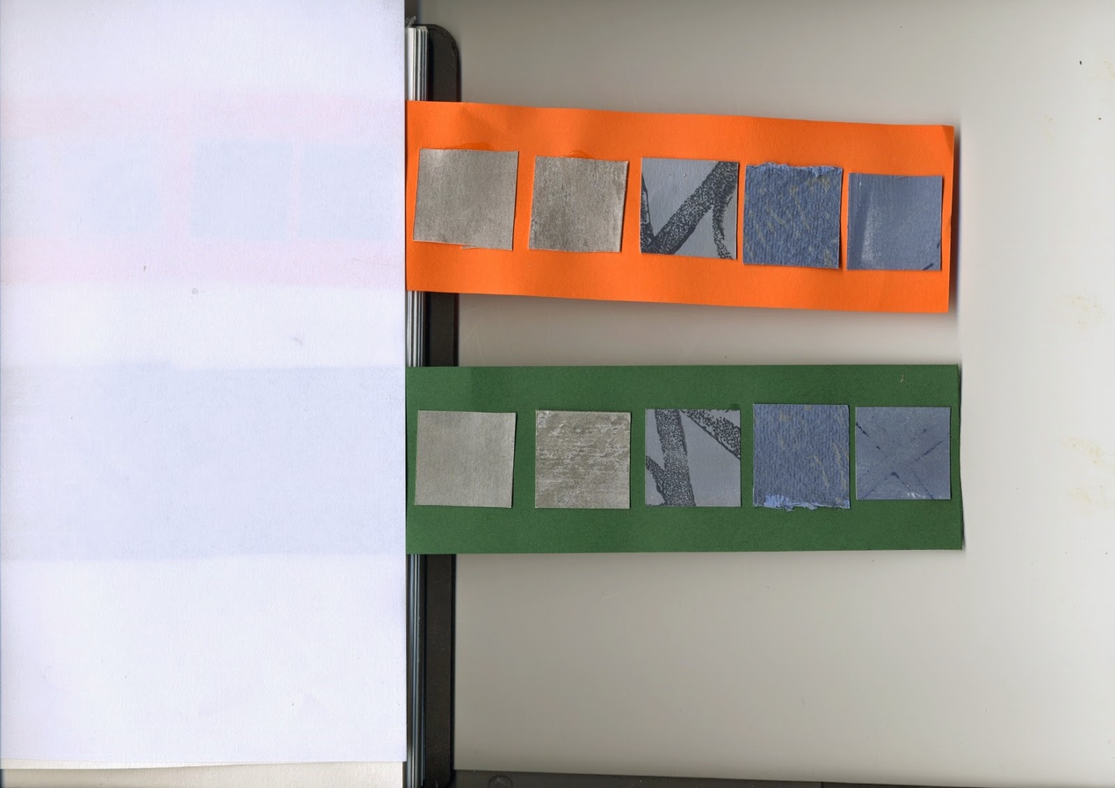
The next part of the chapter involved a methodical study of how a colour's background affects it. I found this quite difficult as the reality did not appear to be in line with the theory. I have read (in part) "Interaction of Color" by Josef Albers, as well as "Contemporary Quilts, Design, Surface and Stitch" by Sandra Meech and expected the colours to "sing" most when the contrast was greatest, i.e. against their complementary. On pages 82 and 82a below, squares of the blue/grey range of papers are placed on a yellowish and blue background. In theory, those on the yellow background should stand out the most but I do not find this to be the case


On the next page, samples from the same papers are placed on a range of "neutrals". I find all these combinations pleasing, but there is no doubt here that the greatest contrast is against the black background, especially at the lighter value end of the strip. This makes the colours more prominent.


Finally I set them against two random colours. I find the samples on the orange background more pleasing, probably because it is nearer to being the complementary of the blue-greys, but do not feel that these backgrounds make the samples look appealing.

When doing the exercise with the ochre range of sample papers, the contrast and thus also the impact, was definitely greatest in the case of the blue background. However, I do also rather like how the similarly coloured samples blend in with the yellow background.


Once again, it was the black which provided the greatest contrast and made the colours stand out. I did not find the colours on the grey background very pleasing at all.


On the next page, the contrast against the dark green is quite pleasing, but I find the contrast against the orange too discordant.

