


Then, however, I started to isolate some sections and copy them into a Word document to play with them further. Wow! I could have gone on for ever, but the following are some of my most promising results.
The first two are just different arrangements of the same selection but in the second, the eye is very much drawn to the lighter area in the centre with the dark, bow-tie shapes.

In the next one the dark lines almost join to make a a continuous wavy line. I also like the suggestion of propeller blades formed by the yellow parts.

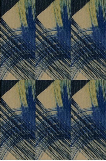
Then things started to get really interesting! Although the original paintings were somewhat dull because of the large areas of neutral background, I was able to make exciting selections by isolating a selection with more colour on it. By coincidence, it also contains one half-square and two quarter-square triangles and therefore lends itself to various patchwork patterns. The same 8 squares are used in each of the next 3 designs but with very different results. I think these are particularly successful because of the contrast between the bright yellow, the dark blue and the light blue.


To sum up, this has been a really good chapter with endless possibilities. It has also taught me that Word is not a good programme for manipulating images, at least not if you want to save them as a jpeg image! However, in overcoming the problems I have also learned a lot more about using my computer for this type of work. In the end, in spite of kind suggestions from my techie husband and from Siân, I found the answer all by myself and that is most gratifying. For future reference for myself as much as anything, I used Preview to take a selective screenshot of the page in the Word document, then exported it as a jpeg. Simples!
No comments:
Post a Comment